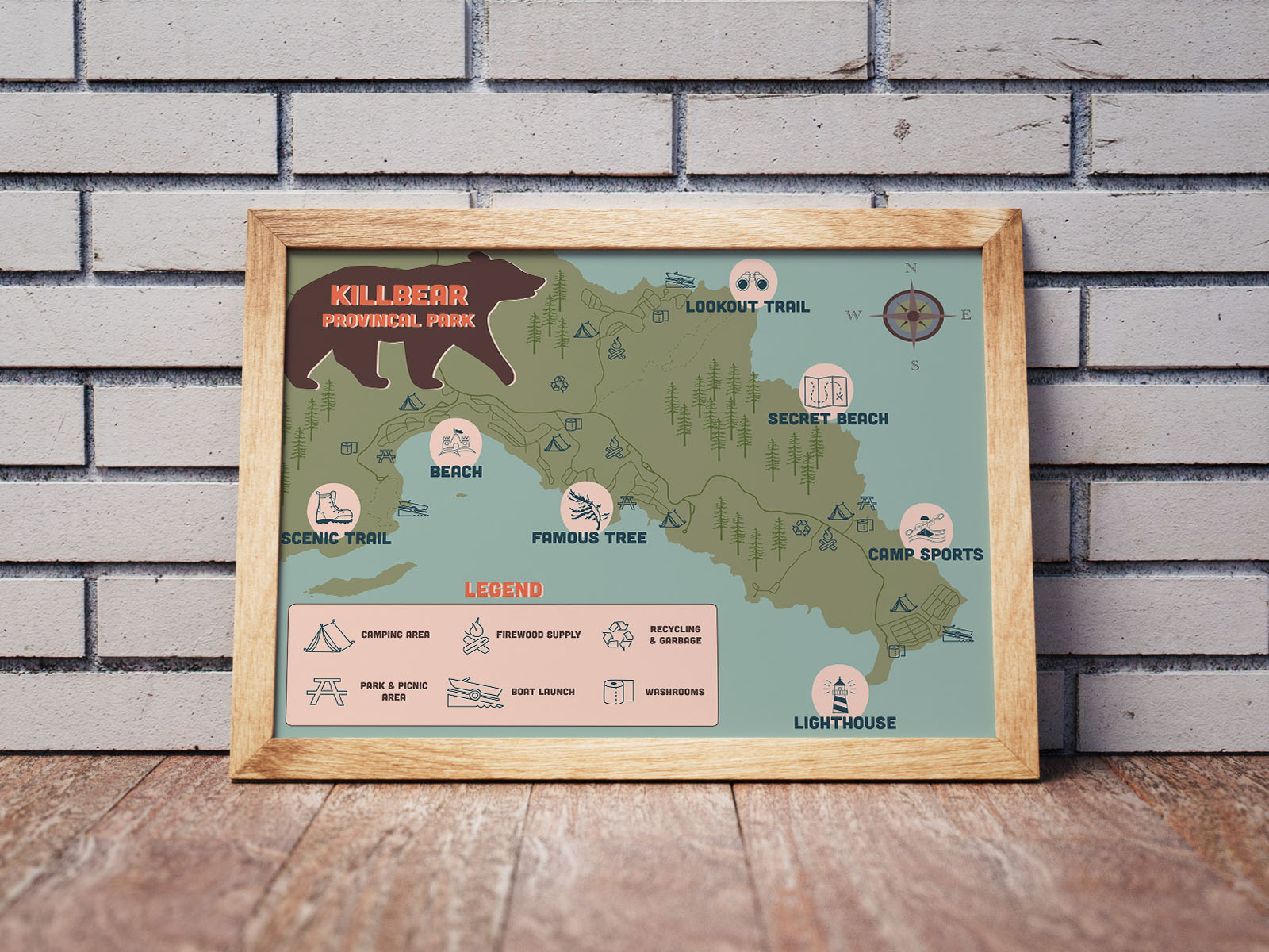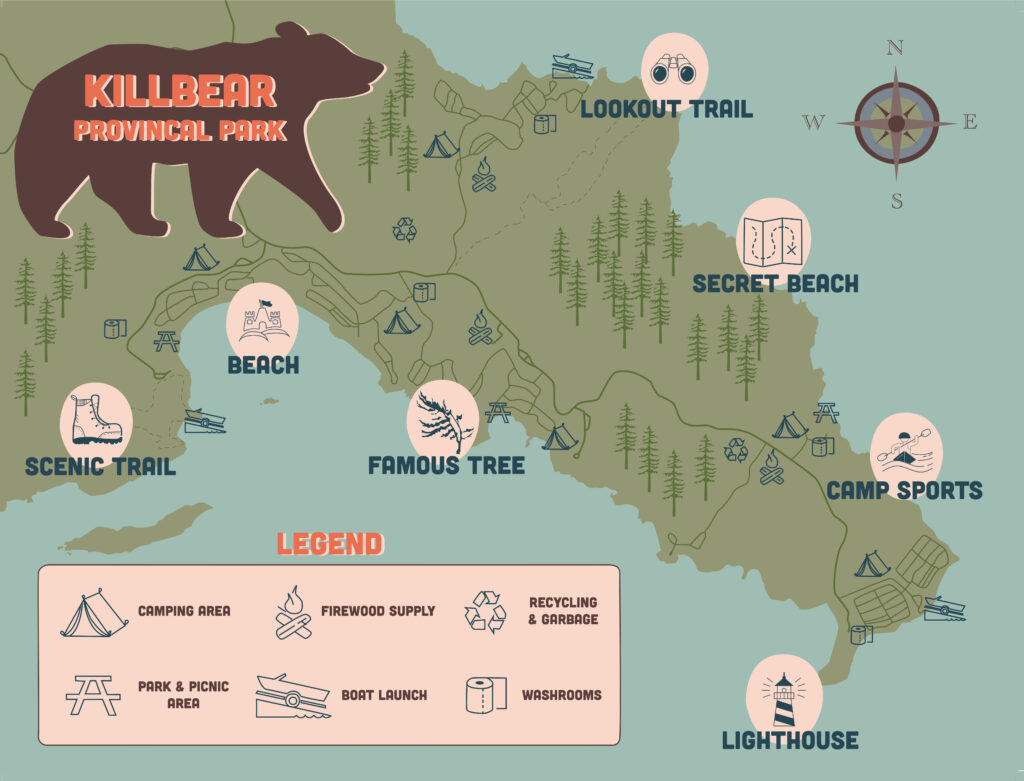
Map
Stylized map of kilbear park
I visit Killbear Provincial Park annually to go camping and for this project I was tasked with creating stylized map for the park. For this design I wanted to combine a vintage style with simple illustration elements to visually communicate my favourite places to visit.
For my entire map, I have only used four colours and variations of tints to achieve a
monochromatic look. For my main icons, I have placed them on an imperfect circle to create a cohesive rugged look. This also draws visual interest to those icons in specific, since they stand out more and provides depth. I also chose to use a similar illustration style for my secondary icons and have them placed without the circles so that it does not distract from the important aspects of the map.