City Rebranding
Martha’s Vineyard Rebranding
For this rebranding, I designed Martha’s Vineyard, an island south of Cape Cod in Massachusetts in the United States. The entire concept for the brand identity is to highlight what Martha’s Vineyard doesn’t have: towering buildings and the feeing of the busy city life. Martha’s Vineyard is known for its natural beauty and provides an escape that is nostalgic, charming and embraces the simple joys. I focused on branding the place as a playful summer getaway for families to visit.
The primary colour palette resembles the classic charm and boutique feel you’d find on the island and watching the sunset by the ocean. The pastel colour run is to represent the laid back, simple and playful aesthetic. All icons, brand artwork and logo variations have a cohesive illustration style to ensure brand identity.
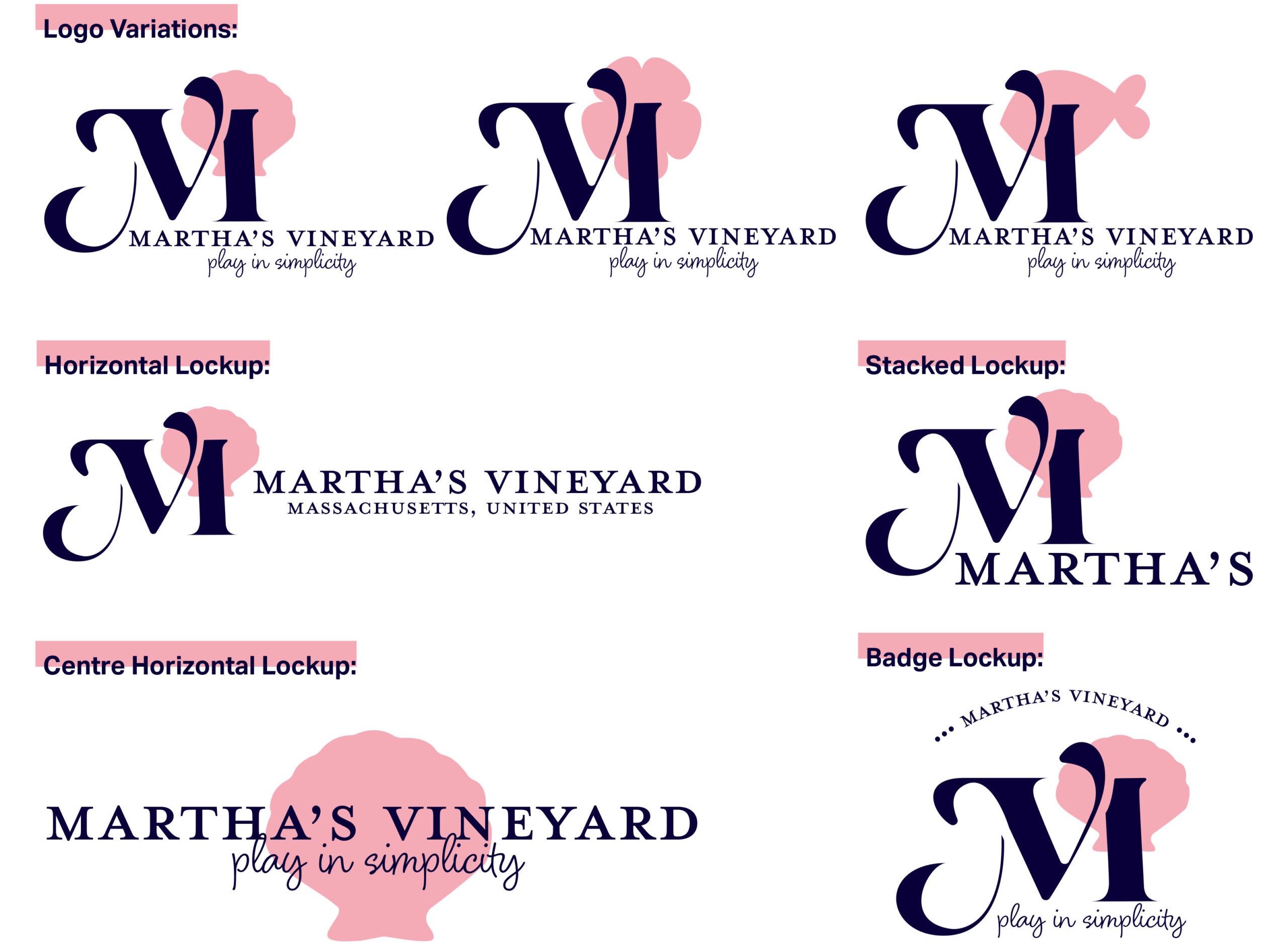
For my monogram logo design, I have elevated an existing typeface and added elements to the “M” to have curves that resemble the surrounding ocean. I have also separated the elements of the “M” so there is a subtle nod to a “V” within the logo, which hints at the name Martha’s Vineyard.
Design system

logo guidelines


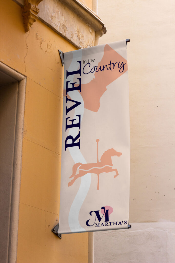
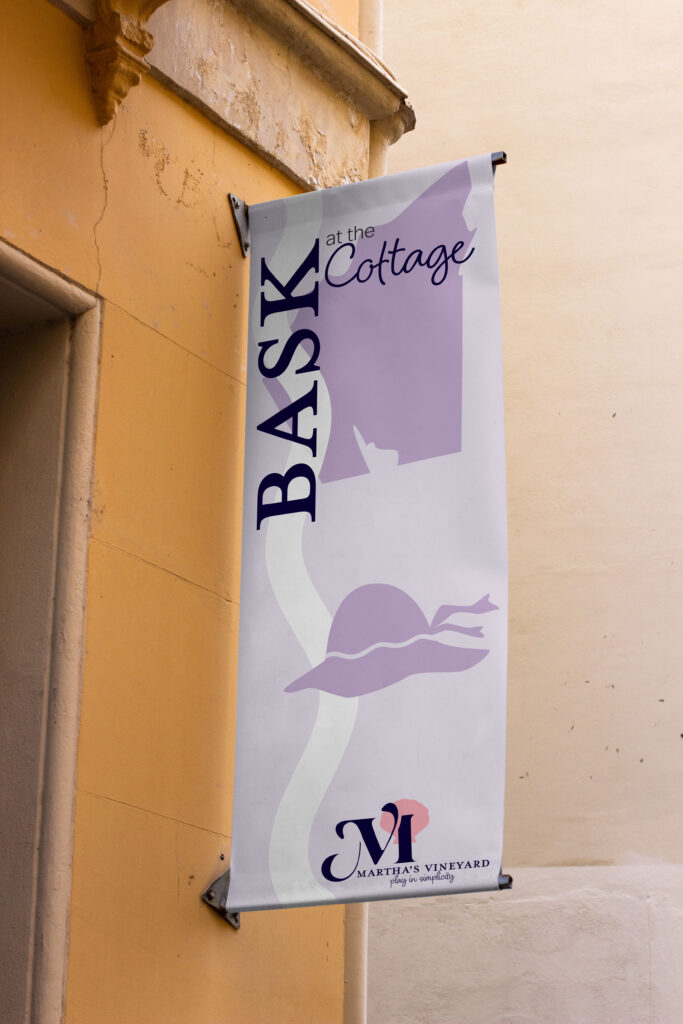
city banners
