Seed Packets
Planting Seeds of creativity
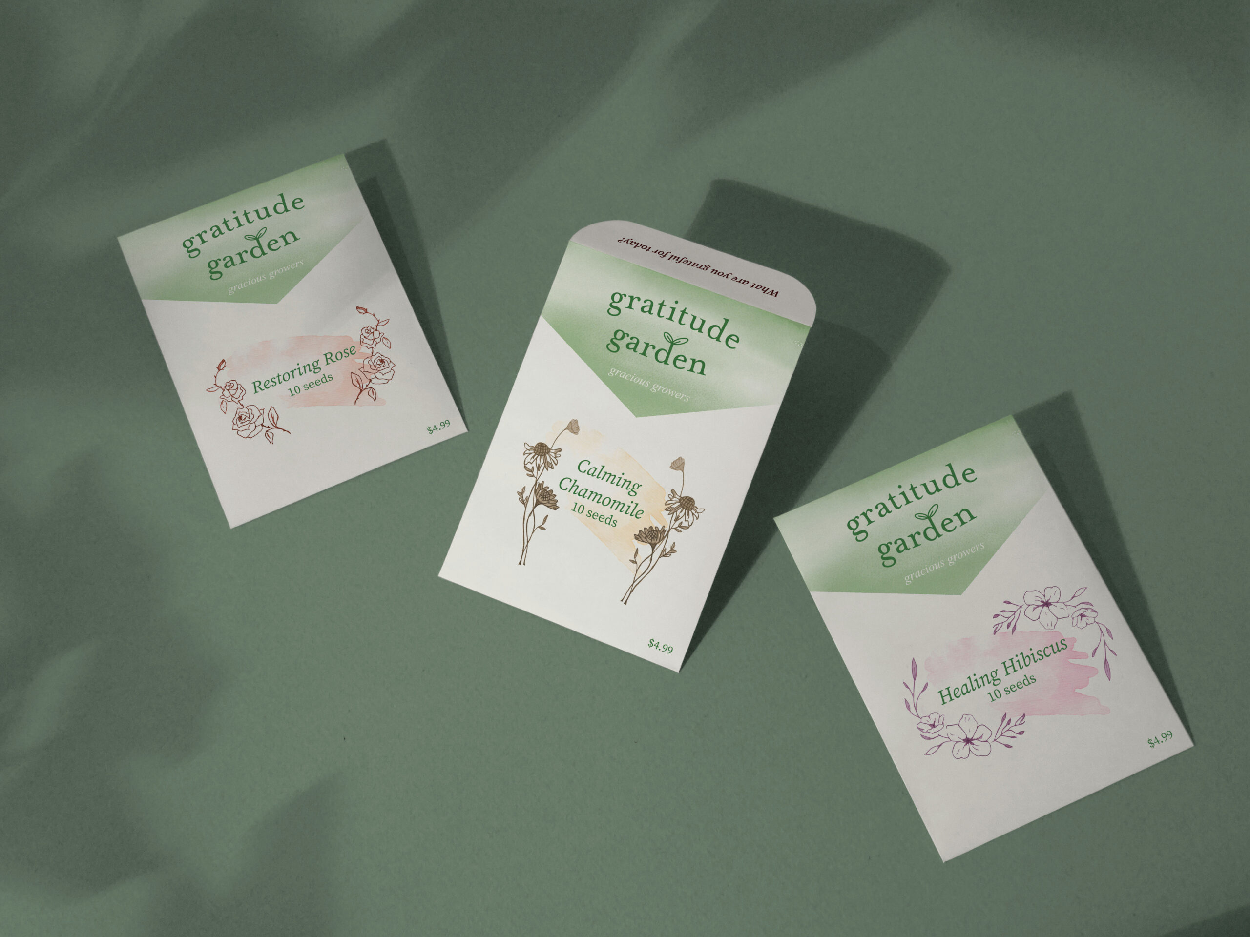
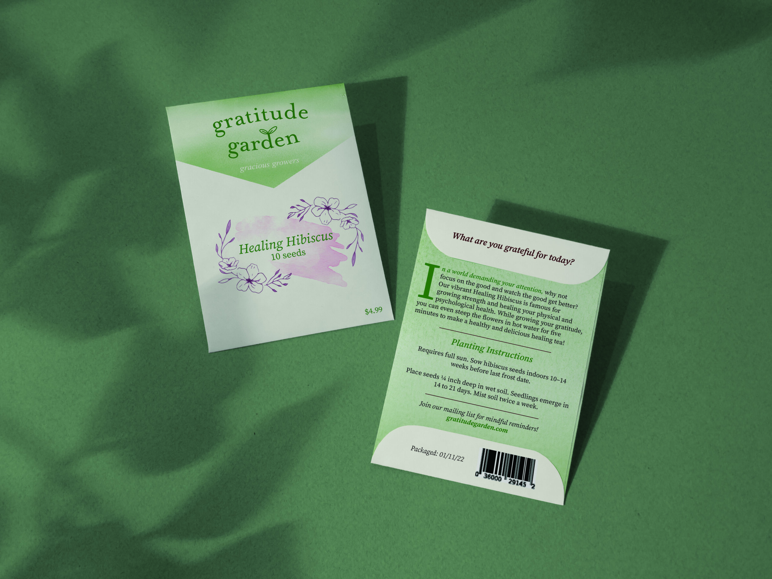
For this project, I was tasked with designing seed packets for something I’d like to plant into viewers. I have created three seed packets for a company I named Gratitude Garden. The three seed packets all have the same purpose: to plant gratitude in others — something I am very passionate about.
For this project, I created a simple logo design to match the soft and delicate theme. I chose to use a light and friendly colour palette that remains consistent for all packets to ensure brand identity. To differentiate the plants and their specific qualities, I used a watercolour brushstroke effect along with hand-drawn illustrations on the front of the packets. This helps the audience to clearly associate the products with their respective colour and illustration, while still retaining the delicacy and consistency.
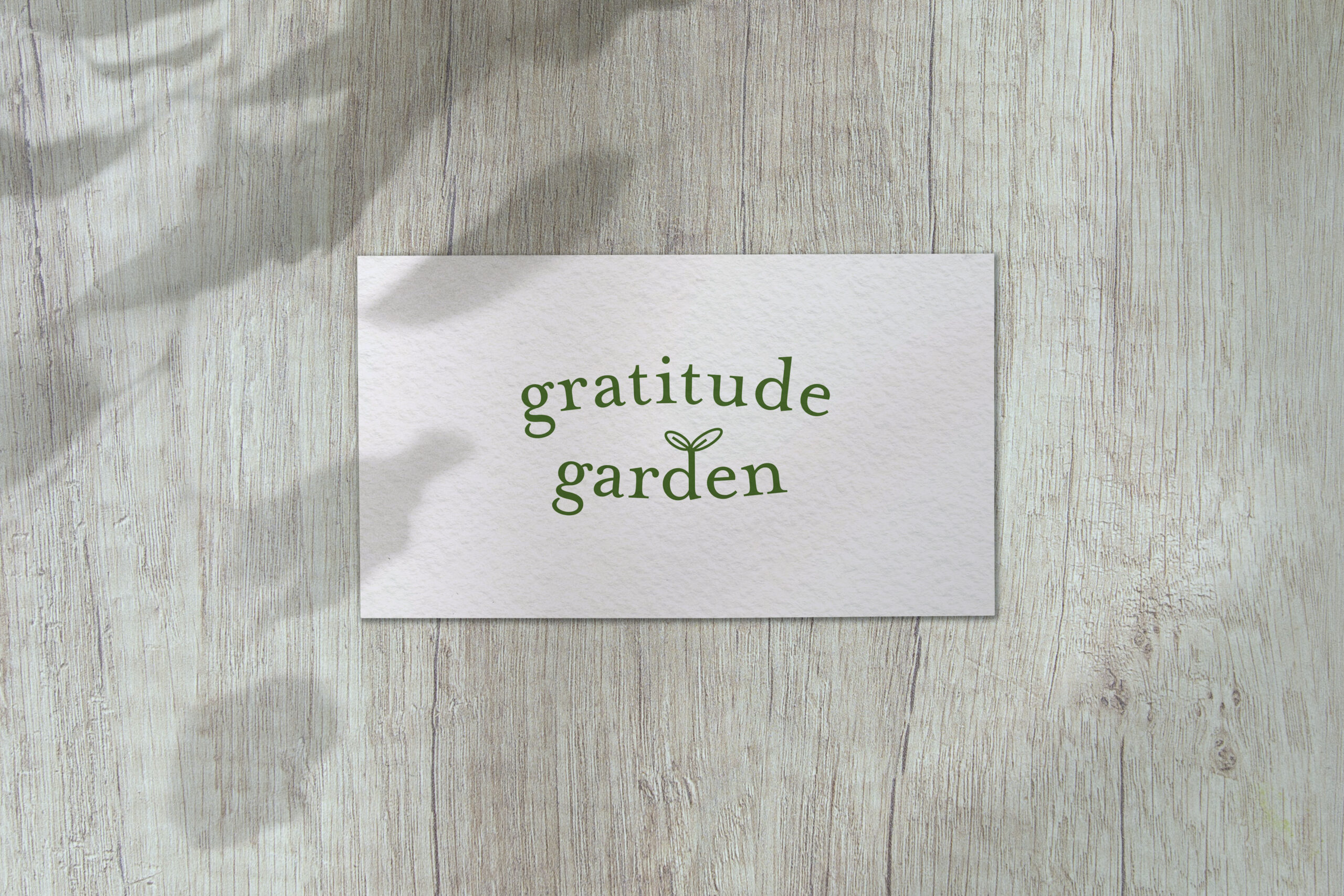
logo design
For this design, I wanted my logo to represent how the seeds will help the customer to grow their gratitude while maintaining a soft and welcoming tone of voice. This is why I chose a wordmark logo, focusing on the gentle and classic typeface. I also incorporated a small sprout to resemble a seedling on the ascender of the “d” to visually represent the growth. I chose to use the rich green to connect the customer with the positive feeling of nature, health and tranquility.


